

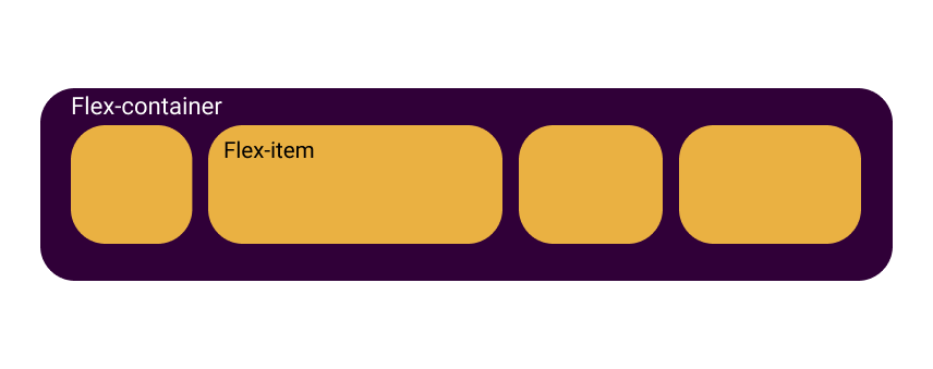
Other than Grid Layout System CSS has another layout system usually known as Flexbox.
Flexbox is a one-dimensional Flexible box layout.
Helloo and welcome to the article #3.1, part-1 of "Let's Flexbox it", In this article we are going to learn about Flexbox and it's feature
So what are you waiting for, let's dive into it:
wondering why I defined one dimensional layout here? What does it mean?
Well, it simply means, flexbox lay out the items in one direction at a time, either in a row or a column, detailed information here about it.
The Display property
To determine that you want to use an element as a flexbox, we need to set it's display property to flex or inline-flex:
.flex-container{
display: flex;
}
The flex-direction property
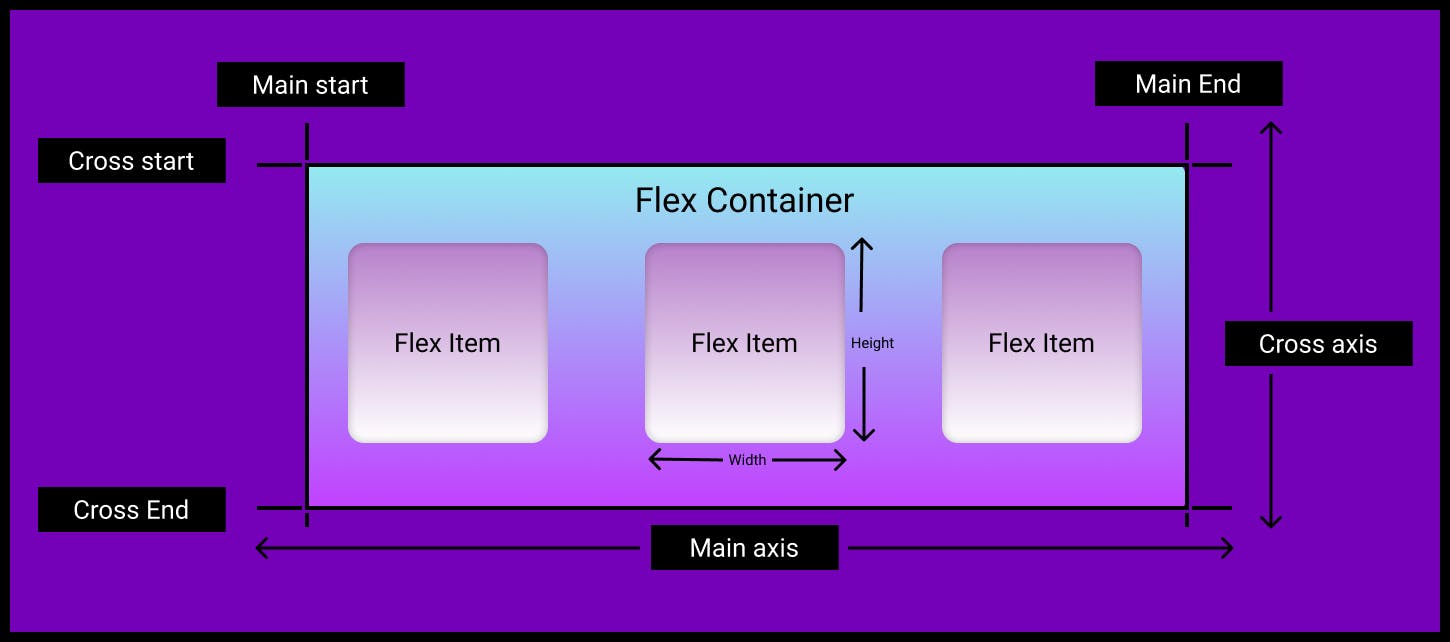
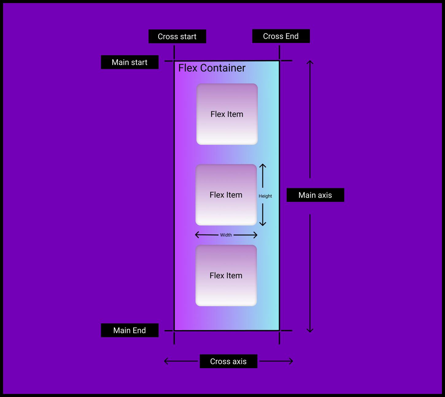
Before getting into flex-direction, It's important to know the terminology behind the flexbox that is: it establishes a two axes concept, known as Flex Model.
At this point, I assume that you are familiar with axes(x-axis and y-axis) in mathematics, if not try taking a look on it,
just like that flexbox lay out the items along two axes known as:
the Main Axis and the Cross Axis
Main axis
Think of it as the main direction to lay out the items in, direction is defined using the flex-direction property, the start and end of this axis are called main start and main end
Cross axis
Cross axis is the perpendicular axis to the main axis, The start and end of this axis is known as cross start and cross end
Now that you know the terminology behind flexbox,
let's get on the track:
To set the direction to lay out the flex-items in, we use the flex-direction property:
.flex-container {
flex-direction: column;
}
and set it to one the following four values:
- row: (default) to layout the items in a row from left to right,
row-reverse: to lay out the items in a reversed row(from right to left),
column: to lay out the items in a column(from top to bottom),
comumn-reverse: to lay out the items in a reversed column(from bottom to top),
The axes for row alignment looks like:
The axes for column layout looks like:
the flex-wrap property
By default, flexbox tries to fit all the flex-items in a single row, which might sometimes not be good enough to maintain the flow of the layout(it can break the layout), like this:
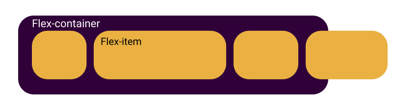
To control this kind of issues we have flex-wrap property,
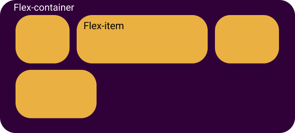
by setting it to wrap value we can tell the browser to wrap the items into a new row if they can't fit in a single row or if their combined width is larger than the width of the flex-container:
.flex-container {
flex-wrap: wrap;
}
this results the above flex-container like this:
possible Values:
- wrap: to wrap the items to a new row(top to bottom,
- no-wrap: (default) fit all the items in a single row,
- wrap-reverse: wraps the items to reversed rows(bottom to top)
the flex-flow property
Flex-flow is the shorthand property for flex-direction and flex-wrap,
and it follows the following syntax:
.flex-container {
flex-flow:  row  wrap;
}
the justify-content property
To align the items along the main axis, we need to set the justify-content property:
.flex-container {
justify-content: center;
}
possible values:
- flex-start: (default) to align the items to the beginning of the flex-container,
- start / end: items are aligned to the beginning or the end of the writing mode direction respectively,
- left / right: to align the items to left or to right of the container,
- center: items are centered in the container along the main axis,
- space-around: items are distributed with equal amount of space around each of them, using this value you will notice some unequal space to the first and last items, that's because it adds equal(fixed) space to both sides of each item, see the below example image,
- space-between: it pushes the first and the last item towards the edges of the container and evenly distributes other items in between them,
- space-evenly: unlike
space-aroundthis value distrubutes the items in such a way that all the items have equal space in between them and equal space to the edges, - flex-end: to align the items to the end of the container.
the align-items property
To align the items along the cross axis, align-items property is used:
.flex-container {
align-items: flex-start;
}
Possible values:
- stretch: (default) stretch the items along the cross axis to fill the remaining space in the container while respecting the min or max of height or width,
- flex-start: align the items to the beginning of the container,
- center: to align the items to the center of the container,
- flex-end: it aligns the items to the end of the container,
- baseline: aligns items with the baseline of the text inside,
End of Let's Flexbox it ......part-1
These were the properties to be applied to the parent element(flex container), You can read about the properties to be appliled directly to the items (which allows us to change the alignment of individual items) check out the part-2 here.
stay safe, keep learning, keep growing