Hellooo and welcome to the Blog #2
In this article I am going to discuss about CSS Grid Layout System
So let's get started :-
Grid is a powerful layout tool in CSS, that let's you easily design a complex layout using "row and column approach".
Brief history:-
Before we dive into it, let's take a look on some history of CSS Grid System:
- The modern concept of a 'grid layout' has been around since it was first introduced by Microsoft in 2012, but
- According to Dr. Bert Bos, who co-created CSS with Håkon Wium Lie, grid-based layouts have actually been on his mind for quite some time.
“CSS started as something very simple,” Bos recalled. “It was just a way to create a view of a document on a very simple small screen at the time. Twenty years ago, screens were very small. So, when we saw that we could make a style sheet for documents, we thought, Well, what else can we do now that we have a system for making style sheets?”
“Independent of the content on every page, it has a certain layout,” Bos said. “Page numbers are in certain places. And images are always aligned to the certain sides—left or right or in the middle. We wanted to capture that.”
After going through a lot of changes to the initial specifications, Grid made it's way to get the browser support in 2017, almost all major browsers(Chrome, Firefox, Opera, and Safari) had shipped support for CSS Grid.
Now let's dive into what Grid is and how you can implement it
Grid Containers
A Grid container is an html element that contains the grid-items.
To make an element a grid container you just need to set it's display property to grid like:
.grid-container{
display: grid;
}
you can use inline-grid too:
.grid-container{
display: inline-grid;
}
Grid Items
Each direct child to to the grid container is a grid item, it means you don't need to do anything much than just adding your html element you want as a grid item inside your grid container element, that's it.
Grid Lines
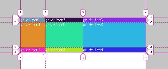
The lines that indicates the start and the end of a row or a column, these lines create the grid, these lines are counted from 1 at the top left corner of the grid, and move to right for columns and to down for rows while increasing the count. with the help of these grid lines you can define where to place a grid item inside a grid container as shown below:

Setting up a grid container to place grid items inside:
to setup a grid container you need to set the following properties
grid-template-columns:
This property lets you define the number of columns you want to have inside your Grid-Container along with the width of each column, as shown in the Grid-line above there is only one column, as like:
.grid-container{
display: grid;
grid-template-columns: 20% 300px 1fr;
}
the above code will create 3 columns with the width of 20% of the container, 300 pixels and whatever space is left inside the grid-container respectively, example below.
grid-template-rows:
Using this property you can set the height of rows respectively.
.grid-container{
display: grid;
grid-template-columns: 20% 300px 1fr;
grid-template-rows: 30% 100px 1fr;
}
the above code will do set the height of the rows as 30% of the grid-container to the first row, 100 pixels for the second row, and it fits the third row to the content's height inside it.
Grid-gap
Just like grid lines it belongs between two rows or two columns, but grid gap is used to add some space between them. To add gap between columns only, try:
.grid-container{
grid-column-gap: 1rem;
}
To add gap between rows only, try:
.grid-container{
grid-row-gap: 1rem;
}
or you have a short-hand for both of the above properties:
grid-gap: grid-row-gap grid-column-gap;
.grid-container{
grid-gap: 1rem 2rem;
}
placing an item in a column
here comes the actual use of grid-lines, using these lines you can set which grid-item to be placed in which column, how? to do that you need to use following properties:
.grid-item{
grid-column-start: 1; //number of line from where you want to start the column
grid-column-end: 3; //number of line where you want to end the column
}
placing an item in a row
you can set which grid-item to be placed in which row, using the following
.grid-item{
grid-row-start: 1; // number of line from where you want to start the row
grid-row-end: 2; // number of line where you want to end the row
}
you can use the shorthand property for both of the above properties, like this:
.grid-item4{
grid-column: 1 / 3; // grid-column-start / grid-column-end
grid-row: 1 / 2; // grid-row-start / grid-row-end
}
see the example below how I defined where to place the grid-item1 and grid-item4:
Align an Item Horizontally
In CSS Grid, the content of each item is located in a box called as "Cell", You can align the content's position within the box(cell) horizontally using the justify-self property on a grid item. Values accepted by this property are:
Stretch: Default value, it will make the content fill the whole width of the cell.
start: aligns the content at the beginning(left) of the cell,
center: aligns the content in the center of the cell,
end: aligns the content at the end(right) of the cell.
Align an Item Vertically
Just like aligning the content horizontally, you can align the content within the box(cell) vertically using the align-self property on a grid item. Values accepted by this property are:
Stretch: Default value, it will make the content fill the whole height of the cell.
start: aligns the content at the beginning(top) of the cell,
center: aligns the content in the center of the cell,
end: aligns the content at the end(bottom) of the cell.
you can play with the properties using the code-pen below:
but what if you want all of them to have the same alignment,
CSS Grid got you covered, you have justify-items property for horizontal alignment, and align-items for vertical alignment, add these properties to the grid container.
Creating grid areas
you can create an area by grouping the cells and then name those areas, for that you need to follow the following syntax:
.grid-container{
display: grid;
grid-template-areas: "header header header header"
"main main main sidebar"
"footer footer footer footer";
In the above code each word is a cell and each pair of quotation marks represents a row and it defines 3 rows and 4 columns but it merges the top four cells into an area named as 'header', then it makes two areas in the middle row and named them 'main' and 'sidebar' respectively and the bottom four cells as 'footer', but if you want to make an empty cell you can use a period (.).
After creating the areas-template you need to place an item in your area by referencing the name you gave it. To do this, you use the grid-area property on a grid-item like this:
.grid-item1 {
  grid-area: header;
}

.grid-item2 {
  grid-area: main;
}
The repeat function
Now let's think you need to add more than 10 or say more than 20 rows and columns of equal size,
Are you gonna type 1fr 20 times?
No, you don't need to do that, CSS grid got you covered here as well
CSS grid have a built in function called as repeat(); using this function you can have any number of equal sized rows or columns.
Now take a look how to use it:
.grid-container {
  display: grid;
  grid-template-columns: repeat(3, 1fr);
  grid-template-rows: repeat(3, 5rem);
}
it will produce the following result:
The minmax function
Now assume your app will be used on multiple devices which obviously means going through multiple screen sizes, and you need to resize your items using media-queries right?
Not anymore,
here comes grid's another handy function named as minmax,
using this function you can define the minimum and maximum size to the grid-items, so when the grid-container's size will change, the grid-items will adopt accordingly as well,
let's see how it's syntax looks like:
  .grid-container {
       display: grid;
       grid-template-columns: 100px minmax(150px, 1fr) 70px;
  }
Usign auto-fill
and now you have fixed the sizing issue for screen variations now what if you want it to be responsive,
worried?
well, no need to be,
because the repeat function we just talked about comes with a built-in keyword that is auto-fill,
what does this keyword do huh🤔?
well using auto-fill you don't need to worry about setting how many columns or rows you will need,
just have to use it the following way:
  .grid-container {
        display: grid;
        grid-template-columns: repeat(auto-fill, minmax(10rem, 1fr));
        grid-template-rows: repeat(auto-fill, minmax(2rem, 5rem));
}
Using auto-fit
auto-fit works almost like auto-fill. but what auto-fit will actually do is, when the grid-container's size exceeds the size of all the items combined, auto-fit collapses those empty rows or columns and stretches your items to fit the size of the container.
Note: If your container can't fit all your items on one row, it will move them down to a new one.
and the syntax is :
  .grid-container {
        display: grid;
        grid-template-columns: repeat(auto-fit, minmax(10rem, 1fr));
        grid-template-rows: repeat(auto-fit, minmax(2rem, 5rem));
}
Thanks for reading so far!
That's it for now, this was my second article, hope you enjoyed the read, the only purpose to write this article is to share some information or knowledge that I think will be very useful to be shared, if I missed something please let me know through comment section.
Thanks again, hope you have a nice day 👋...
